Page 1 of 1
my ooma web page looks awful
Posted: Wed Oct 14, 2009 2:40 pm
by HubScout
The new website for my ooma is awful.. The icons are all messed up. Anyone else have this issue?
I'm using IE v.6
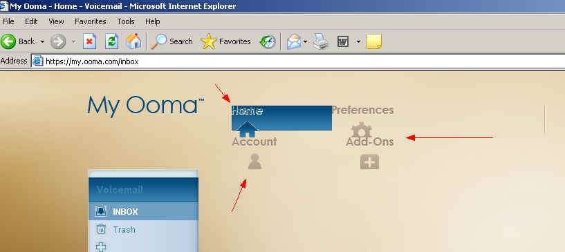
- ooma.jpg (26.45KiB)Viewed 4261 times
Re: my ooma web page looks awful
Posted: Wed Oct 14, 2009 3:11 pm
by murphy
IE 6 is obsolete. No one programs to it's capabilities anymore.
Upgrade to IE 8 or install Firefox.
Re: my ooma web page looks awful
Posted: Wed Oct 14, 2009 3:24 pm
by hpepper
yep - The whole thing looks great on IE8
Re: my ooma web page looks awful
Posted: Wed Oct 14, 2009 3:57 pm
by Bobby B
It should look OK in IE7/IE8 - we'll stick a warning message for IE6 users to use a more recent IE browser or to use Firefox.
Re: my ooma web page looks awful
Posted: Wed Oct 14, 2009 9:37 pm
by Davesworld
Works fine in Konqueror 4 and Opera 10 as well.
Re: my ooma web page looks awful
Posted: Wed Oct 14, 2009 10:00 pm
by HubScout
looks like IE6 is out of luck. Unfortunately this is the standard web browser at work and I cannot upgrade.
Also, at home on my MAC using Safari 4.0.3, the icons are aligned, but the selection screen cuts them as seen in the screen shot.
It does not really affect functionality, it just looks un-professional..
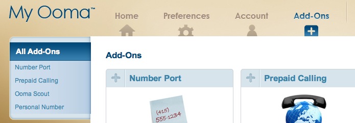
- Picture 3.jpg (40.98KiB)Viewed 4208 times
Re: my ooma web page looks awful
Posted: Wed Oct 14, 2009 10:23 pm
by southsound
HubScout wrote: Also, at home on my MAC using Safari 4.0.3, the icons are aligned, but the selection screen cuts them as seen in the screen shot.
It does not really affect functionality, it just looks un-professional..
Uh... that is the way the web wonders at ooma designed the page. Not sure why and I agree that it looks unprofessional - but I also have a problem with the way MTV jiggles around a camera during a head shot. I guess I'm just old school. Not quite a shirt and tie sort - most of my wardrobe is tiedyes - but I like icons that are fully formed.

Re: my ooma web page looks awful
Posted: Thu Oct 15, 2009 2:42 am
by murphy
HubScout wrote:looks like IE6 is out of luck. Unfortunately this is the standard web browser at work and I cannot upgrade.
Your IT department is not earning it's keep. They should have gone to IE7 long ago. Are you also running Windows 2000? IE6 is the last browser that Win2K supported.
Re: my ooma web page looks awful
Posted: Thu Oct 15, 2009 7:21 am
by WayneDsr
looks like IE6 is out of luck. Unfortunately this is the standard web browser at work and I cannot upgrade
I feel his pain. I was laid off in Jan from a large auto dealer group and at that time we were still forced to use IE6 for some of the auto manufactures online products that weren't keeping pace with new software releases. Flash and java were also held at a certain version number.
Wayne
Re: my ooma web page looks awful
Posted: Thu Oct 15, 2009 7:30 am
by dknyinva
Bobby B wrote:It should look OK in IE7/IE8 - we'll stick a warning message for IE6 users to use a more recent IE browser or to use Firefox.
Bobby, try to incorporate this on the my ooma web site
http://www.ie6nomore.com